The client needed a refreshed logo that signaled sustainability without greenwashing.
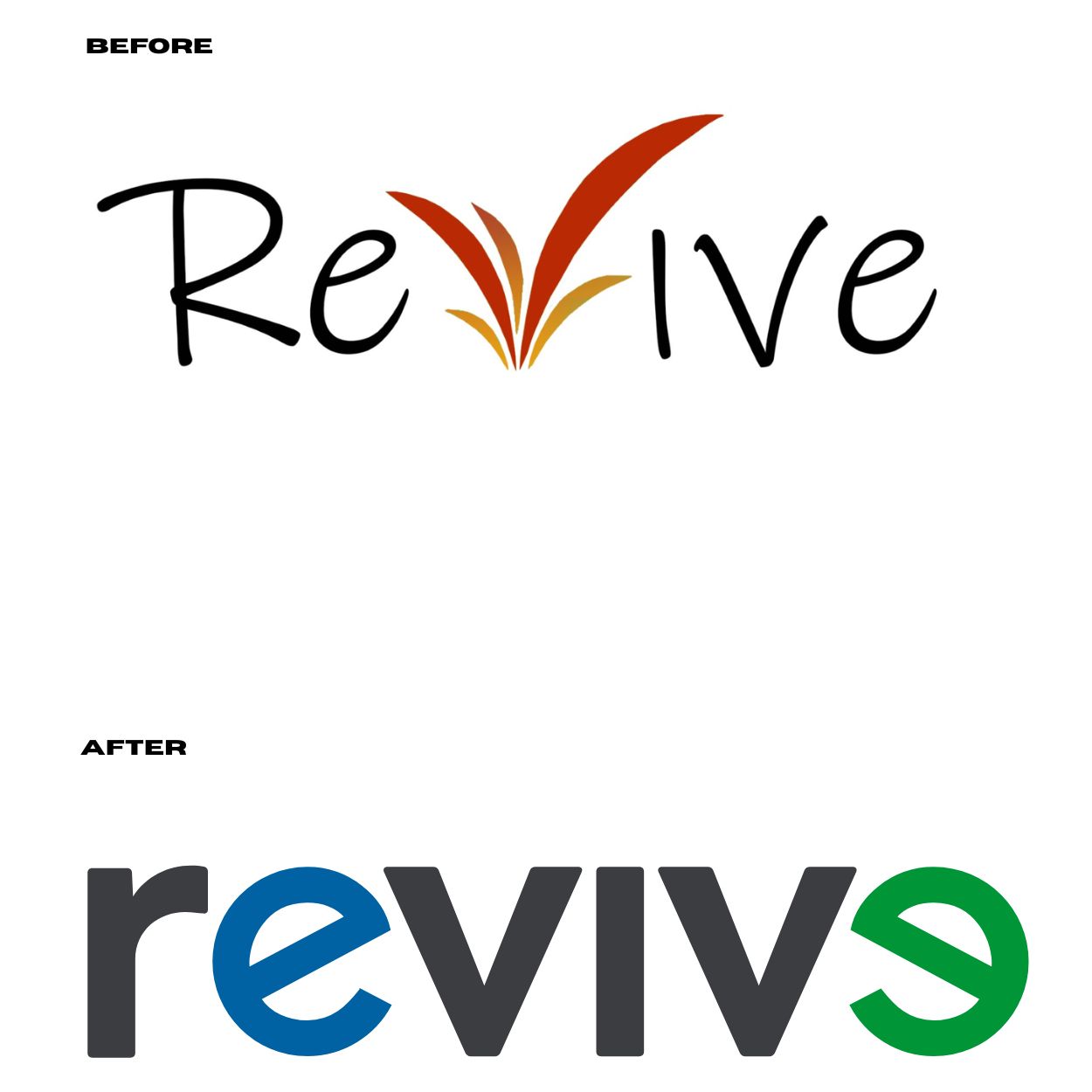
The unique treatment of the “e”s subtly symbolizes renewal, resulting in a meaningful mark that reinforces the Revive line.


.gif)
.jpg)